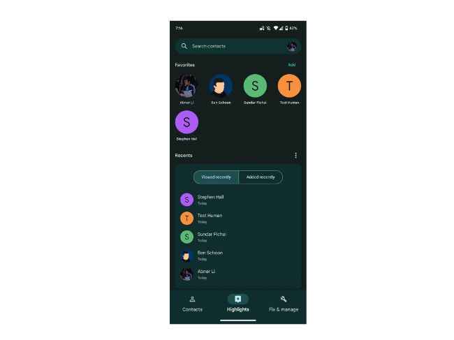
From being a two-tab application, ‘Google Contacts’ has now become a three-tab application with the addition of a new ‘Highlights’ tab. 9to5Google has shared screenshots of this Google Contact feature. Seems like the icon is not the only thing that Google has changed for the Contact app this year.
Google Contacts Highlights tab: What’s its use
To know where you can find this new tab, you just need to go to the app and it shall appear between ‘Contacts’ and ‘Fix and Manage’ in the bottom bar. The 'Favourites' appear below the search tab. The 'Highlights' tab is more user-friendly because it is denser than ‘Favorites’ and contacts can be more easily added in this tab.
The ‘Highlights’ tab is the one that people may shift to, to interact with the app as a whole. Why do we say so? Well, it takes out the need to scroll through contacts and one can just look for the contact. And other than that the grid format in which it is set in makes the application more interactive and accessible than the list.
Hence the ‘Highlights’ app may have given a smarter approach to the app as a whole.
What are the other tabs available on Google Contacts?
Other than that, there is also the ‘Recents’ tab that starts with ‘View Recently’ and each of the contacts comes with details of ‘view date’ and the overflow menu lets you, as a user, clear the history. Also available is the ‘Added Recently’ which provides the list by rounding it up and is possibly the most useful part of the new ‘user interface’.
‘Fix and Manage’ was a feature introduced for users to be able to edit or delete their contacts easily but it remains unclear now whether or not there was a requirement for a tab just for that purpose.
from Apps News https://ift.tt/RfTD7lY
via IFTTT


0 Comments